
Ecommerce front-end design and code, governed as one system.
Aligned to Shopify workflows, but platform-agnostic by design — so your team can move faster with AI while keeping design and code in sync.
- Design inside real constraints
- Push and pull between design and code
- AI-guided UI that stays on your system
- Control the system from code
- Your codebase stays yours

This isn't a
design of a card.
It's the card.
Toggle properties. Change the ratio. Every control maps to a real component property enforced by the system — the same one a designer uses in Figma and a developer reads in code.
Configure the code, then drop the component directly into your Figma file as a component set—still tied to your system. Make changes and push back to the ShopFront repo.
Tokens aren't styling. They're control.
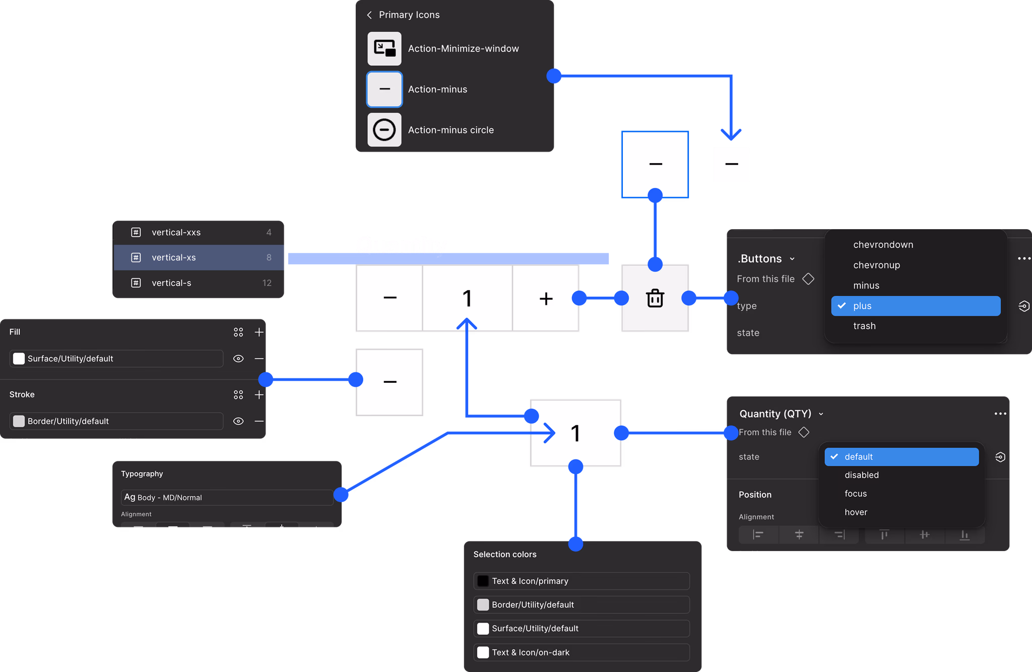
Tokens define the system.
Shopify is one way it ships.
ShopFront tokens exist independently of any tool. For Shopify projects, they map directly to theme scheme variables — so design decisions land in code without a translation layer. For anything else, the same tokens resolve cleanly to the next target.
Every token — surface, text, border, radius, spacing — is system-owned. When you change it, every output changes with it. No per-project reconciliation.
Naming is structural, not decorative. A developer reads a token and knows the role, the scheme slot, and the behavior — without asking. Fewer rounds. Fewer interpretation errors.
One source of truth.
Many targets.
The system lives independent of any tool. Push its tokens, components, and rules into whatever surface your team works in — or into new ones as you adopt them.
The system isn't locked to a vendor. It's locked to your brand, your rules, and your token definitions — portable forward.
The foundation
every team cuts
when the clock starts.
Variable setup. Metaobject schemas. Token-to-scheme mapping. Component documentation. These are the first things descoped on a Shopify build — and the reason inconsistency shows up six months later.
ShopFront ships with this layer already solved. The project starts above the floor most teams never reach.
From wireframe
to production UI.
Start with structure. Apply tokens. The same components move from sketch to shipped — no rebuild, no translation step, no drift between what was designed and what gets built.
Wireframe in under a minute. Final design in about an hour. Same system, top to bottom.

Every element is tied to a governed variable, style, or component — not a one-off design decision.
Whether you build stores
or you are the store.
Same foundation. Different leverage. Licensed separately for agencies and brands.
Tools change. Your system shouldn't.
- Start every project above the foundation most teams never reach
- Ship more work without growing headcount
- Purchase client licenses directly through us
- New designers operate inside guided structure from day one
- Productize your offer — retainers around a real system
- Cut premature redesigns and design debt out of the cycle
- Every vendor and team operates inside the same system constraints
- Token enforcement keeps brand intact as the org scales
- Design maps cleanly to Shopify — fewer errors, fewer rounds
- Pivot without triggering a full redesign
- Direct control over AI-generated output — no free-form drift
- Tool-agnostic — ready for headless, migration, or the next platform
Design teams work directly against the ShopFront library. AI assembles the page inside the system's constraints — tokens, components, section masters — not outside them. Output maps cleanly to Shopify sections.
- AI-speed assembly — brief to frame in minutes, no free-form drift
- Every component stays wired to the live system — nothing detached
- Change a token once, every page downstream updates
- Precision control at every layer — brand, block, component
- Native Shopify sections out — no builder lock-in, no retrofit

What does it cost
to not run on a system?
Enter your numbers. See what drift, rework, and tool-by-tool fixes actually cost across design, development, and ongoing usage.
Conservative estimates across design, dev, and system overhead. Excludes QA savings, revision cycles, consistency at scale, and the foundational work — variable setup, metaobject schemas, token mapping — most projects never finish. Those are the costs of not running on a system.
Get access →The right foundation
on day one.
ShopFront gives design and development teams the structure to move fast, stay aligned, and build across Shopify — and beyond — without drifting from the system.